Unveiling SEO Insights with Python Matplotlib and AI CMO
Data can feel overwhelming. Rows of numbers. Endless spreadsheets. Yet a clear chart can spark an “aha” moment in seconds. In this guide we reveal how Python Matplotlib SEO visualisation transforms raw metrics into actionable control panels. You’ll learn to harness Matplotlib’s flexible plotting alongside AI CMO’s dashboard, so every SEO performance metric becomes a striking, easy-to-read graphic. Along the way we’ll share best practices, code snippets and real-world examples.
Ready to streamline your reporting routines and focus on strategy rather than manual chart tweaks? Harness Python Matplotlib SEO with AI CMO: Revolutionising Digital Marketing Automation shows you how to combine open-source plotting with an AI-powered platform that automates data ingestion, rendering high-quality visuals in real time. By the end you’ll run dashboards that update themselves, leaving you free to interpret insights and drive growth.
Why Data Visualisation Matters for SEO
Effective SEO isn’t just about chasing rankings. It demands:
- Clear benchmarks
- Quick identification of trends
- Data-driven decisions
The Power of Visuals in SEO Analysis
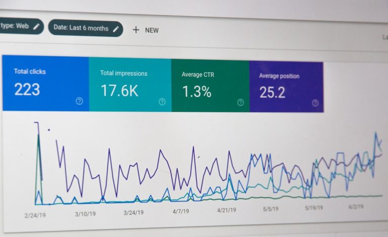
Imagine spotting a loading-time penalty at a glance via a concise line plot. Or comparing ad visibility across mobile and desktop in a single bar chart. Visuals turn complex data into an intuitive narrative. With Python Matplotlib SEO, you control every pixel, from colours to annotations. Yet low-level libraries can require boilerplate code. That’s where AI CMO’s dashboard fills the gap by automating chart generation, letting you focus on interpretation not setup.
By combining Matplotlib’s granular customisation with AI CMO’s hands-on interface:
- You maintain complete styling freedom
- Automated pipelines handle data refresh and export
- Reports embed seamlessly in HTML, PDFs or slide decks
Setting Up Your Python Matplotlib SEO Pipeline
Before diving into advanced charts, establish a robust pipeline. Here’s a concise workflow:
- Data collection
* Use APIs or SQL queries to fetch SERP rankings, Lighthouse metrics and ad impressions - Processing
* Load into pandas or PySpark
* Clean, group and compute percentiles (50th, 40-60th range, for instance) - Plotting with Matplotlib
* Configure global style: grid, fonts, colour cycler
* Create functions for reusable figures like line plots andfill_betweenshades - Integration with AI CMO
* Point the dashboard at your script or data source
* Let the platform render and schedule exports
Example: Styling Your Figures
import matplotlib.pyplot as plt
from cycler import cycler

# Global style
plt.rc('axes', grid=True, labelsize=16, edgecolor='#696969')
plt.rcParams['axes.prop_cycle'] = cycler('color', ['#00b2b8', '#fa5e00', '#404040'])
plt.rcParams['font.family'] = 'Montserrat'
plt.rcParams['grid.color'] = '#B2B2B2'
This snippet ensures every chart adheres to your brand guidelines. Instead of repeating style code, wrap it in a module. Then focus on the story behind your Python Matplotlib SEO charts.
Case Studies: From Website Speed to Ads Ranking
Let’s explore two typical SEO studies.
Analysing Website Speed Performance
In a recent analysis, an R&D team examined 10 000 search phrases across electronics and news sites. They plotted Time to First Byte (TTFB) against Google positions. A simple Matplotlib line chart with fill_between highlighted median response times and the 40-60th percentile band. The result? A clear pattern showing top-ranked pages load fastest. No more guesswork—just a visual prompt to optimise server response.
Comparing Google Ads Visibility
Another study scraped over 7 600 travel queries and tallied ad placements. A horizontal bar chart with barh displayed the top 25 domains by total ad count. Each bar segmented desktop top, desktop bottom, mobile top and mobile bottom. The visual made it easy to compare market share in paid search. With just a few lines of code, Matplotlib summarised complex multi-channel data.
Integrating AI CMO for Automated Dashboards
While Matplotlib empowers bespoke charting, manual script execution can slow you down. AI CMO’s dashboard bridges that gap. Here’s what you gain:
- Scheduled chart updates at any interval
- One-click exports to PDF or HTML reports
- Centralised monitoring of SEO and GEO metrics
- Real-time collaboration for marketing teams
Embrace the synergy of Python Matplotlib SEO and AI CMO’s automation to eliminate repetitive tasks. Now your weekly performance review happens at the click of a button.
Explore AI-powered Python Matplotlib SEO visualisation to see how dashboards auto-refresh without manual intervention.
Tips for Crafting Effective SEO Visuals
Good visualisations follow simple rules:
- Keep axes and labels uncluttered
- Highlight key insights with contrasting colours
- Annotate unusual spikes or drops
- Provide context—compare against benchmarks
- Use vector formats (SVG, PDF) for sharp reports
Quick Wins
- Set a global style at the script start
- Automate exports via AI CMO scheduling
- Leverage template functions for recurring chart types
Best Practices for Collaboration
When multiple stakeholders need access:
- Host your Matplotlib scripts in a shared repository
- Connect your data pipeline to AI CMO’s workspace
- Grant view or edit permissions per user
- Annotate dashboard commentary directly on charts
With a unified platform, your marketing team sees the same polished Python Matplotlib SEO visuals, reducing email threads and version conflicts.
Final Thoughts and Next Steps
You’ve seen how to build a scalable Python Matplotlib SEO solution, integrate it with AI CMO, and create insights that drive action. The blend of open-source plotting and AI-driven automation ensures your data stays fresh and your reports remain consistent.
Ready to elevate your SEO reporting? Get a personalised demo of AI CMO’s Python Matplotlib SEO dashboard and start transforming raw numbers into clear, compelling visuals.